H2A
H2A sells streetwear to shoppers who browse on their phones. I rebuilt the Shopify theme around one interaction: pull a piece off a 3D clothing rail, turn it, then choose a size.
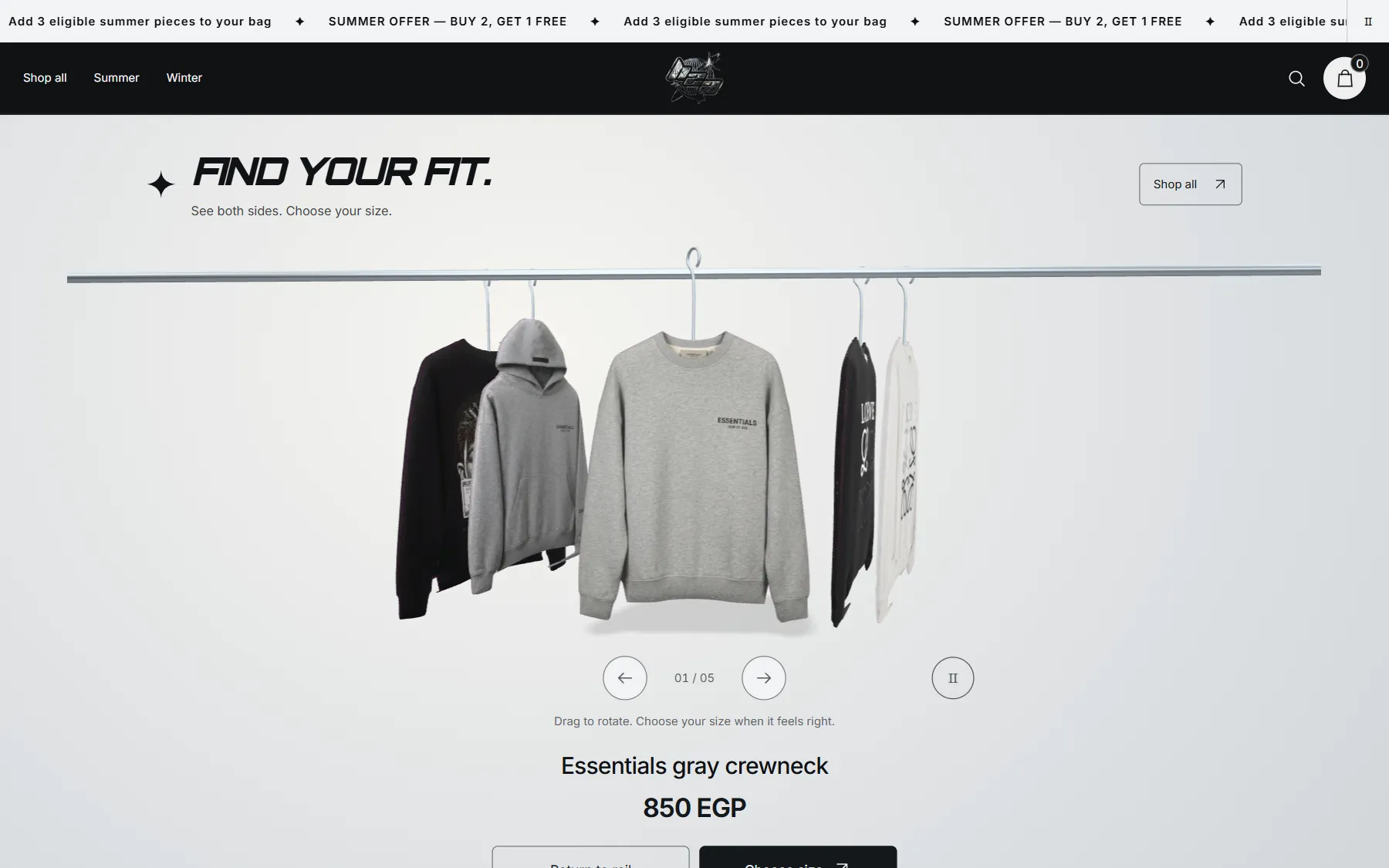
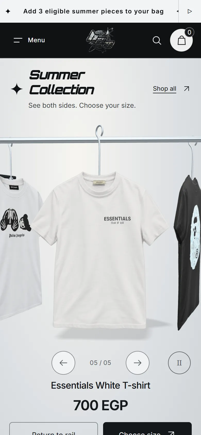
The refreshed storefront on desktop and on a phone, captured from the theme running on the store’s own catalogue.
- Role
- UX/UI design and Shopify development
- Platform
- Shopify Liquid · Three.js
- Scope
- Theme, 3D rail, product pages, sizing, bag
- Live
- h2aa.store ↗
See the piece. Turn it. Choose the size.
Clothing shoppers decide on a few things: the front, the back, the fit and the price. On a phone, a static grid shows the front and little else. The refresh hangs the garments on a rail the shopper browses with a thumb, pulls forward and turns before opening the product page.
The rest is ordinary Shopify done carefully: product pages that lead with the garment, size guidance that answers straight away, and a bag that shows progress toward the summer offer. The store keeps its identity, its collections and its native product and inventory data.
A clothing rail you turn with a thumb.
Each piece is built from the store’s product photograph: the silhouette becomes a curved cloth shape with real thickness, hung on a hanger. Swipe to browse, tap to pull a piece forward, drag to turn it. Motion pauses on touch and respects reduced-motion settings.
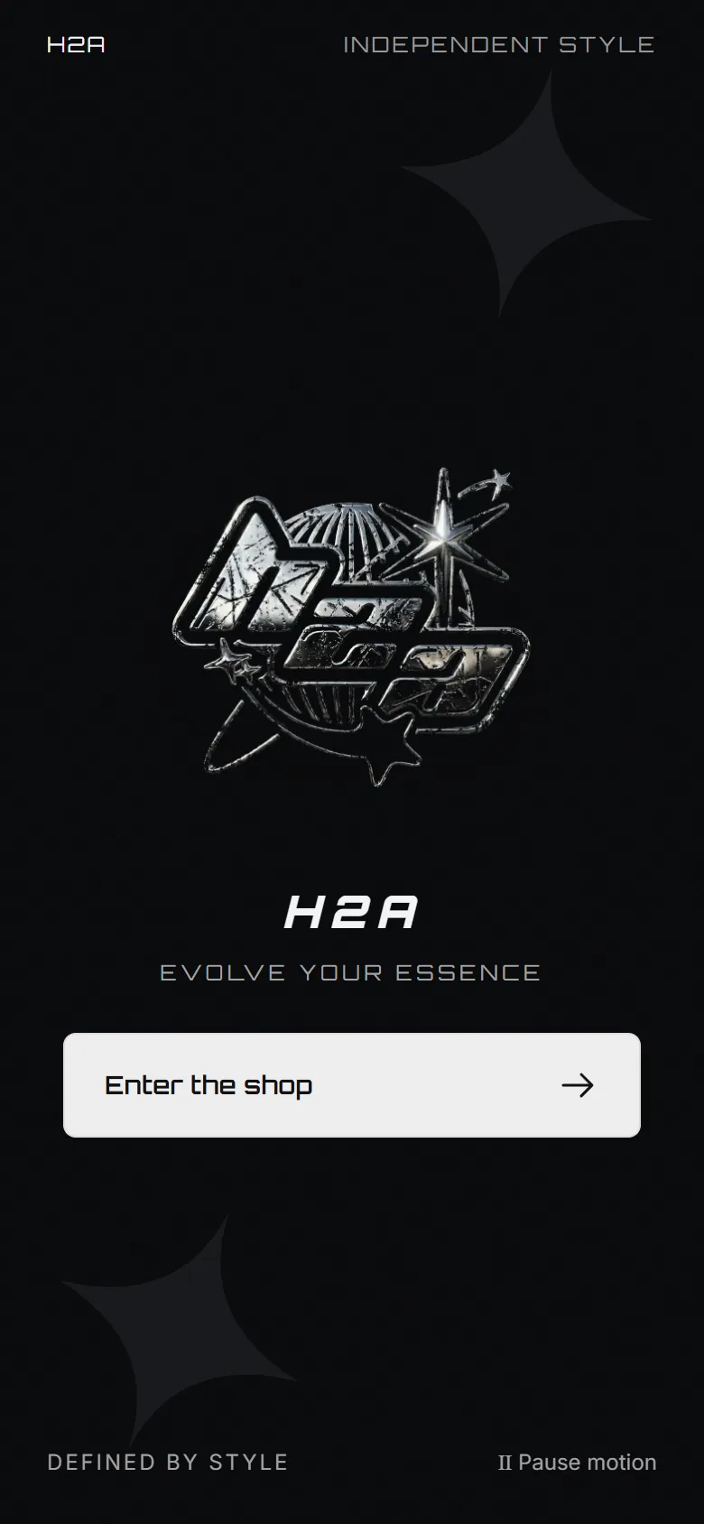
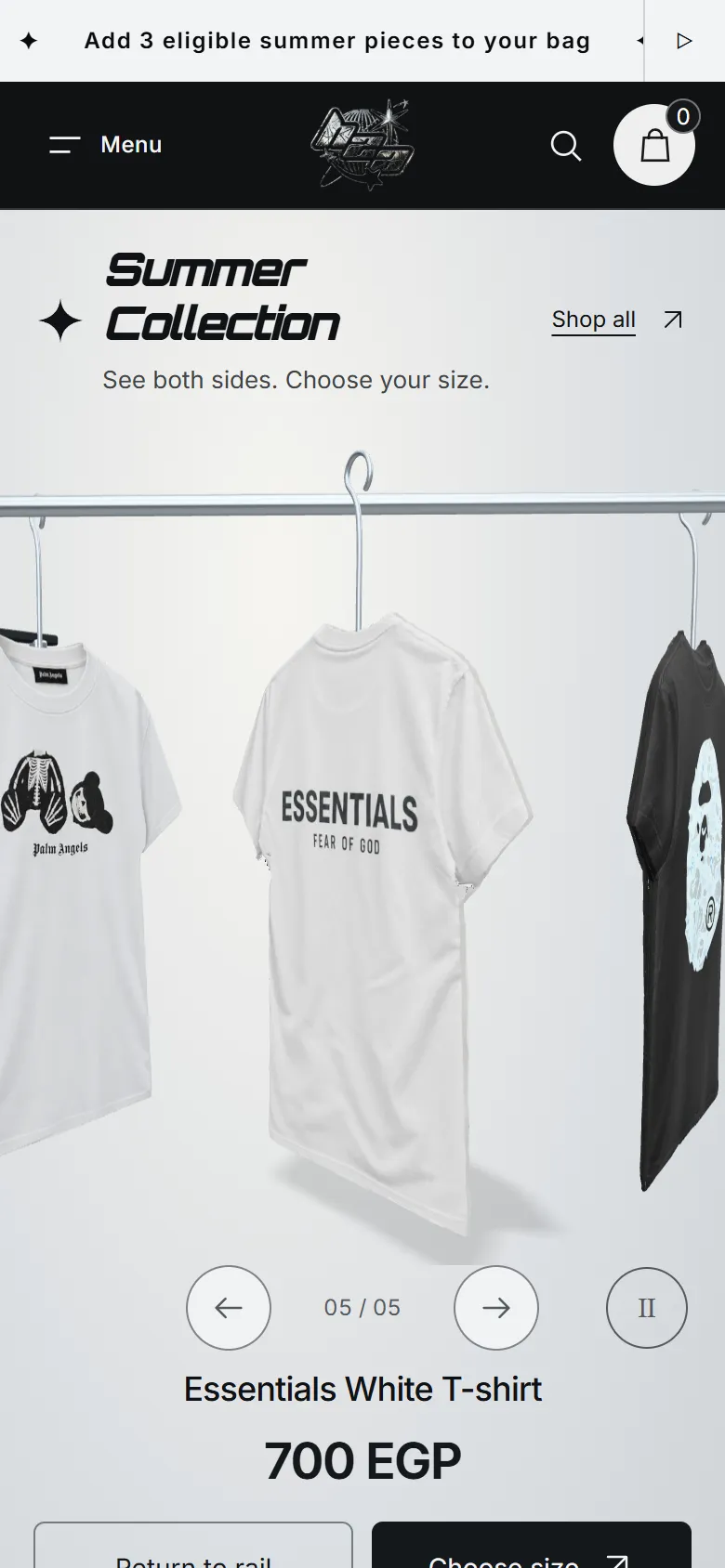
Each season opens on its own rail.
Summer and winter collections open on rails filled with their own products, with the full catalogue below. The season switch marks which one you are in.
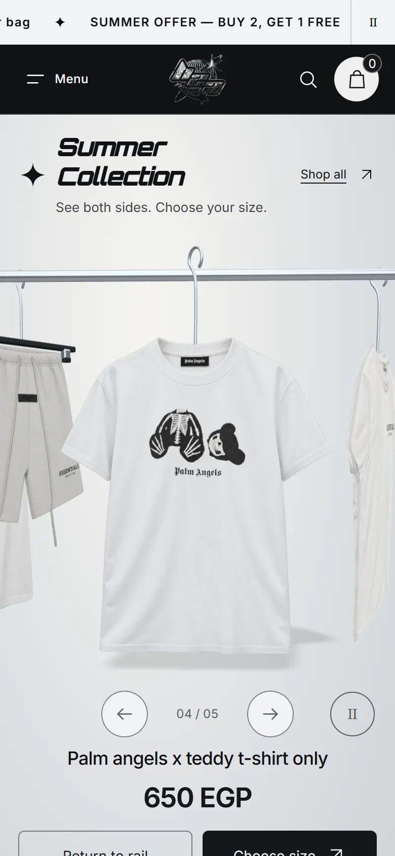
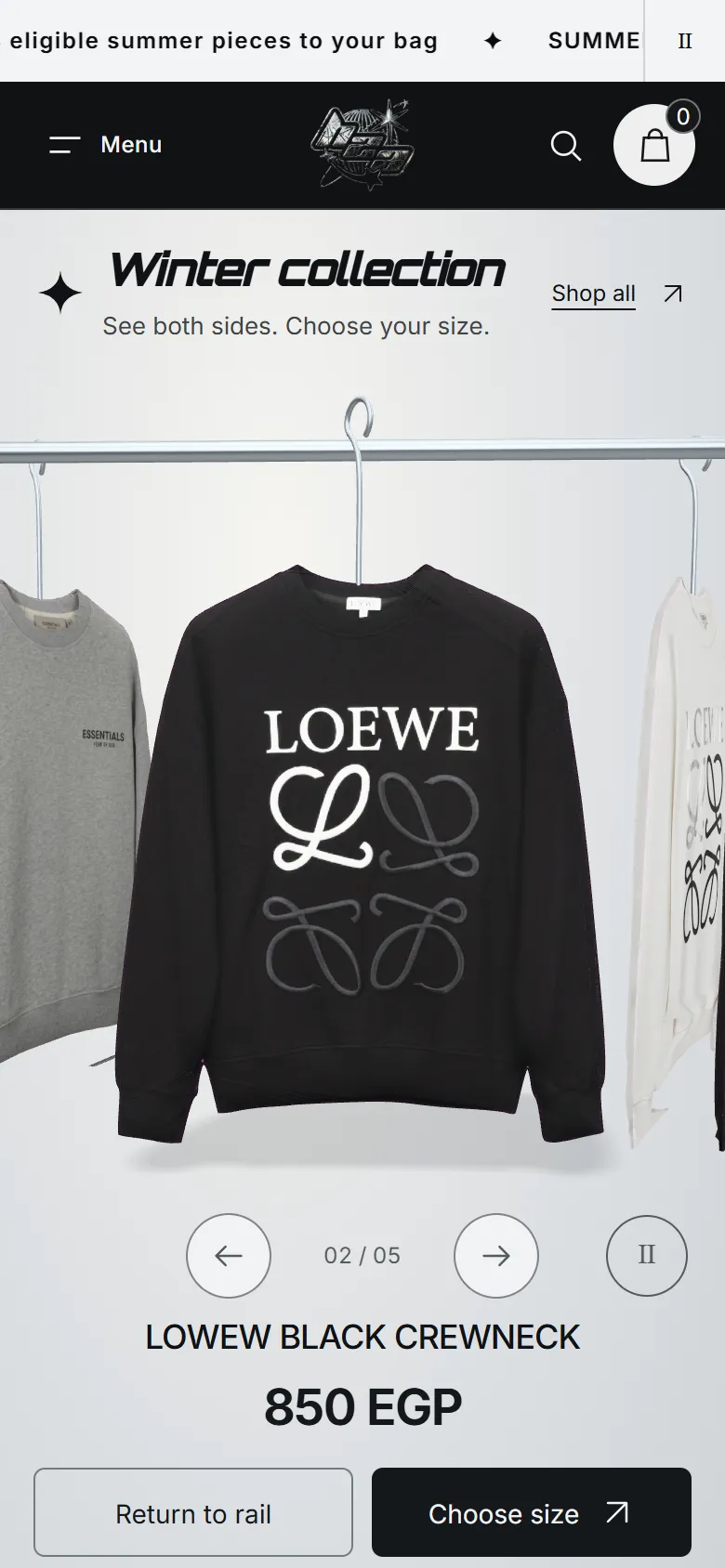
The garment first, then one clear size path.
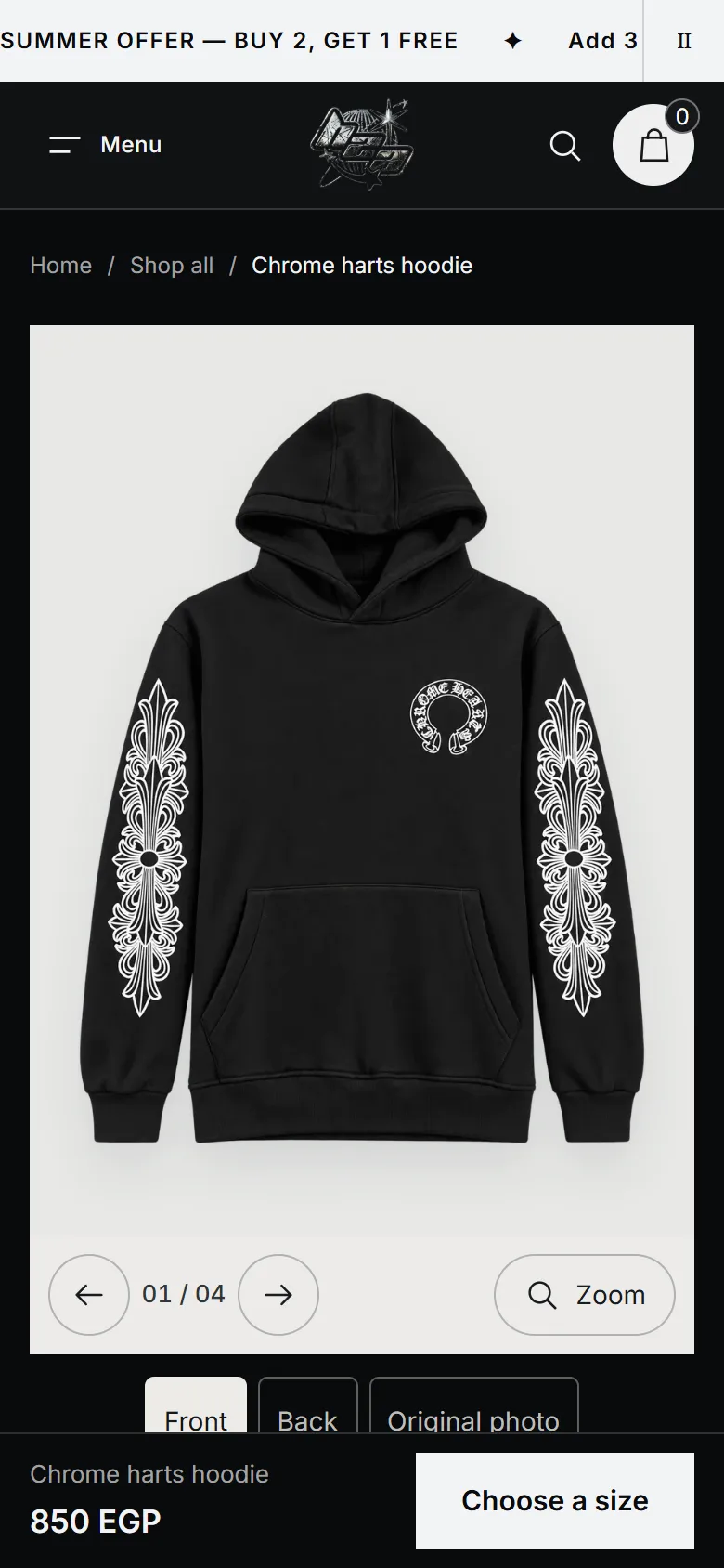
Product pages lead with the photograph, then the name and price. Find my size takes height, weight and preferred fit and suggests a starting size straight away, on the device, with no waiting screen. It is labelled approximate until the merchant adds measured ranges, and nothing goes in the bag until a size is chosen.
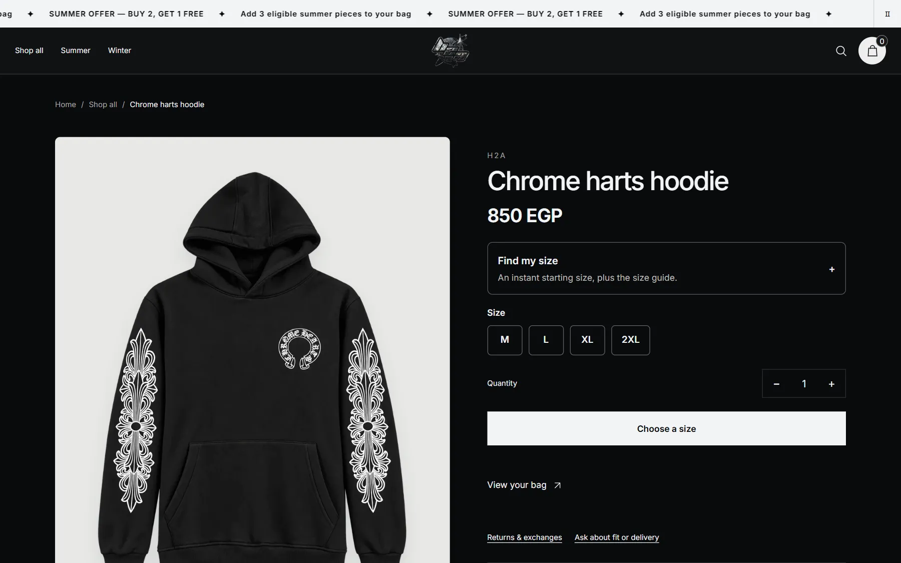
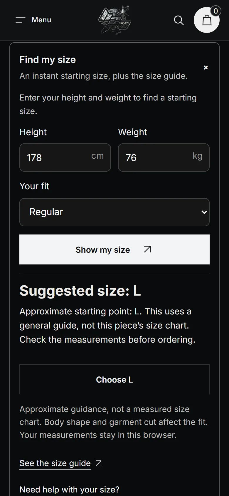
The offer, visible where it matters.
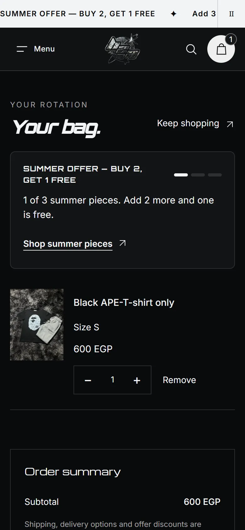
The bag names each size and shows progress toward the summer buy two, get one free offer. The discount is a real Shopify discount applied at checkout; I checked its calculation and the shipping on the live store.
What was verified
- 35 automated tests: pages, stock handling, rails, gallery controls, sizing and the bag
- Shopify theme check without reported errors
- Delivered on the store’s own domain, with native product and inventory data
Honest scope
- Sales and conversion change have not been measured
- The rail is a photo-based representation, not a scanned 3D garment
- Where the store has no rear photo, the rail shows a prepared plain rear; product pages keep the merchant’s own photographs
- Size guidance stays approximate until measured ranges are supplied
The shopping journey, start to bag.
A 36-second recording of the delivered store with Arabic captions: the entrance, the rail, a product page and the bag.
Where do your shoppers hesitate?
Between the product photo, the size choice and the bag, small decisions add up. Tell me which part of your store needs to become clearer.